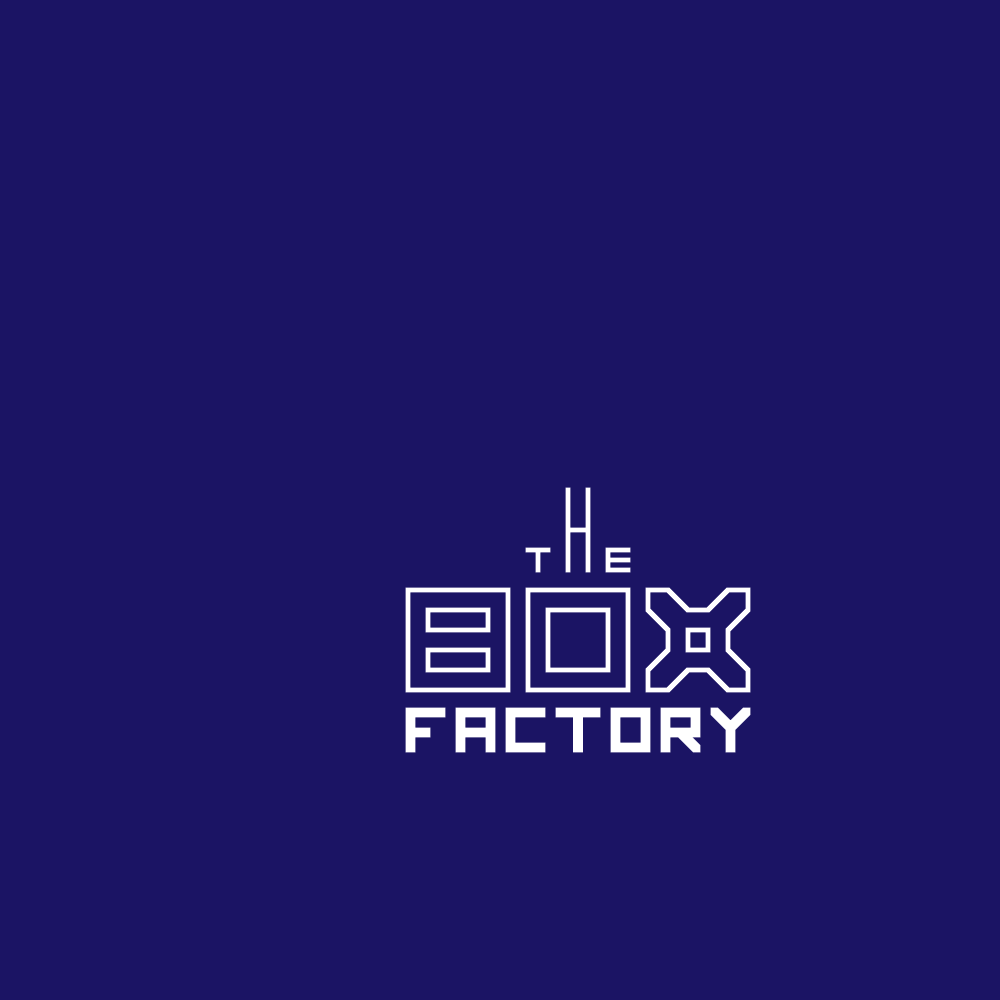

The client required a logo for a shared workspace in a converted box factory.
BOX
Overall - long rectangular shape like the building.
Each letter like looking down at walls subdividing the space.
Because of the dark background, if you focus on the white lines, it looks like depth down to the blue (optical illusion).
The X gives the appearance that it could be folded from flat into a box.
The X ends with points like going forward/new direction - reflecting the change of use of the building.
THE
Styled to add imagery of a factory to the overall design
FACTORY - Square boxlike - all original (not a font)
BLUE
Blue + 65% black to give depth of colour and to complement the brick facade of the building. A little brighter than the blue in your PDF to make it more playful / youthful but still mature.