Geometric Logo Concept for Ascend

0
Created on 99designs by Vista
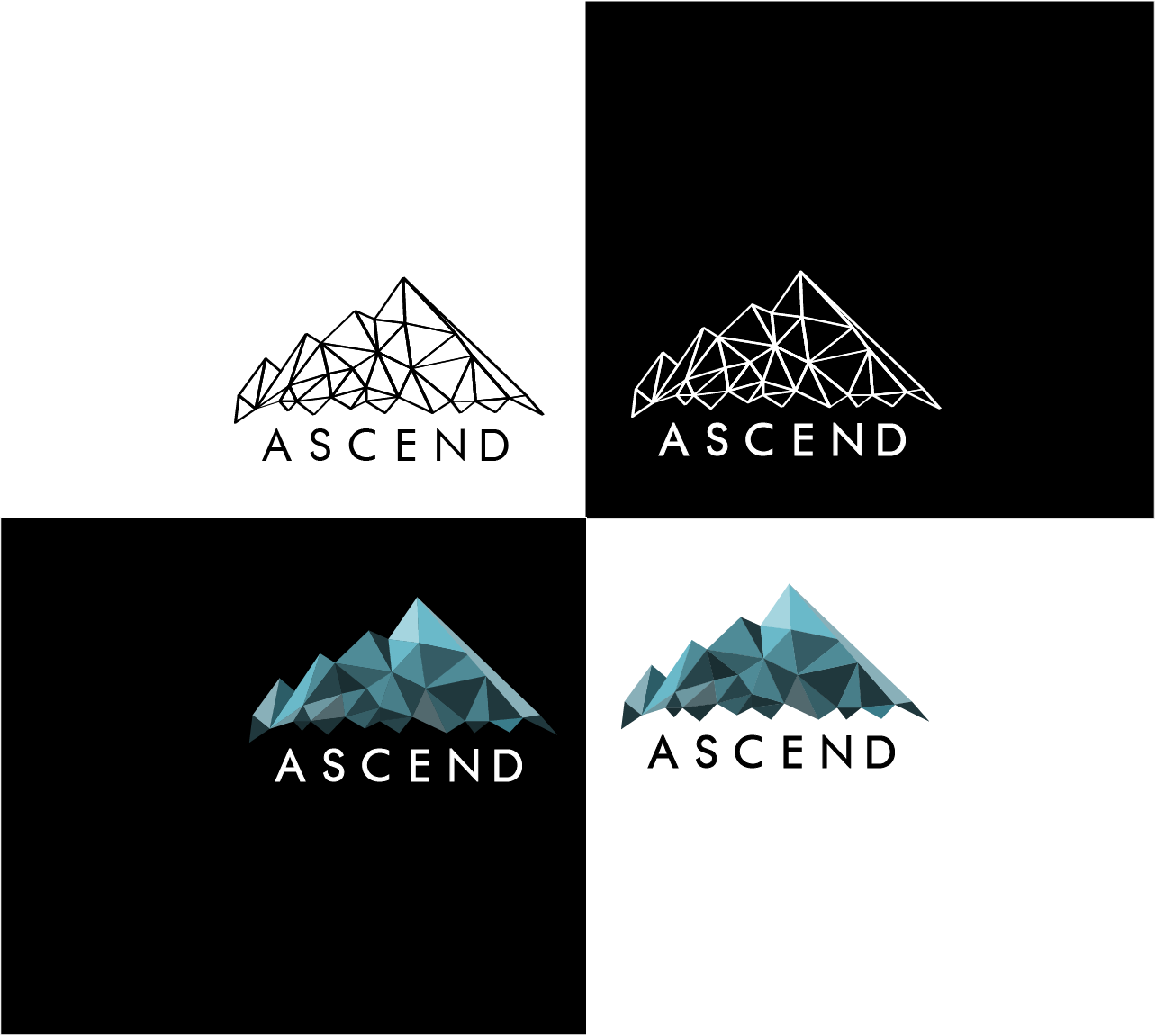
The main idea behind this design was an abstract geometric design of a mountain. The company's name, Ascend, was represented by showing the ascending upwards of the mountain. The colours chosen were used to give the logo a cool feel. The black and white version of the logo, made of up of interconnecting lines/triangles are representative of the work that Ascend does in helping churches grow by enabling them to communicate in a more modern way.