Modern and minimal logo for ceramics company

0
Created on 99designs by Vista
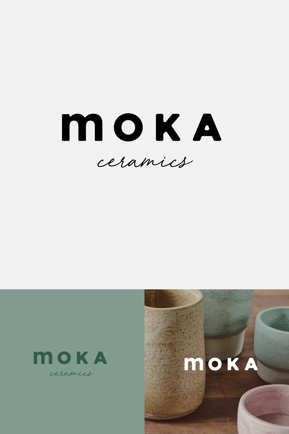
Modern option. Features a playful contrast between 'moka' and 'ceramics'. The curved letterforms in 'moka' relate to the rounded surfaces of ceramic items. The handwritten 'ceramics' relates back to the handmade aspect of the brand. The lowercase 'm' adds another subtle playful element without sacrificing a lux feel.