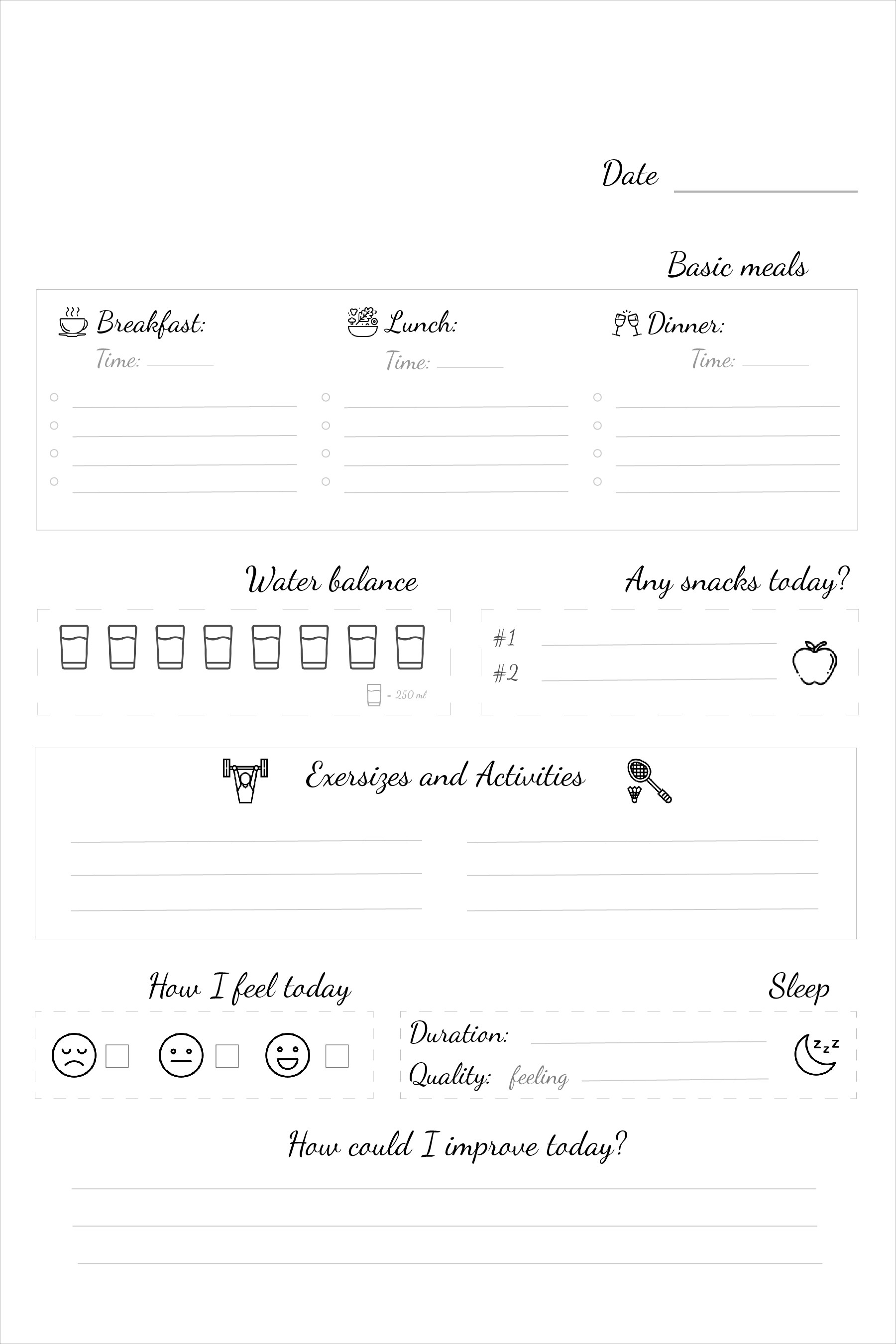
The main idea is to use less of bright black colors (because it dissipates attention), small icons near each section (it helps navigate easily) and script font to make this journal look not too official.