
Created on 99designs by Vista
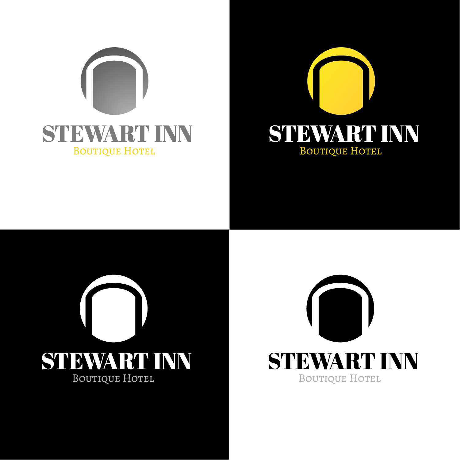
I approached this again wanting to maintain Symmetry, so I used the circle as an anchor for the arch way and then used the arch as the Vocal point of the Logo.
I again explored gray and gold to maintain an upscale look and kept the Type the same as it cooperates well with this logo mark.