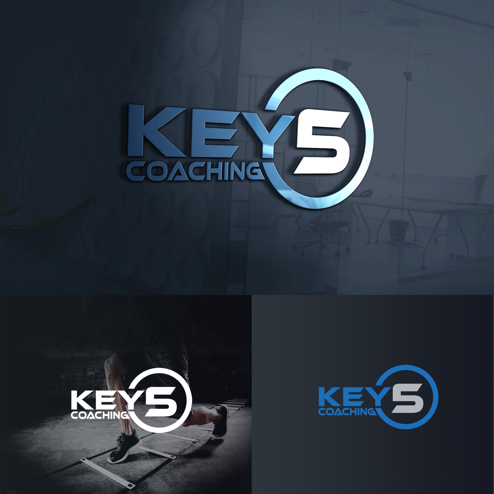

CH's desired design:
1. looks like "KEYS"
2. looks like a key
3. uses blue and gray
my design explanation:
1. I make the word "KEY" cut the circle so that the words "KEY" and 5 are not mutually exclusive
2. I make the logo look solid like a key with a circle and 5 as a key head, KEY as a key bar, and COACHING as a key bar
3. I try to form 5 looks like S by blunting the top left in number 5,
4. the meaning of the circle in the logo is dynamic, moving, having speed, something that is repetitive, uninterrupted, has no beginning or end, is eternal, has quality, is reliable, something that is perfect, and lives. your company will continue to print quality and reliable coaches without stopping very quickly ...
5. the meaning of Y that cuts the circle ... Y starts from YOUNG which means your company will continue to print trainers who grow a talented generation of young people ...