Minimalist logo for music company

1
Created on 99designs by Vista
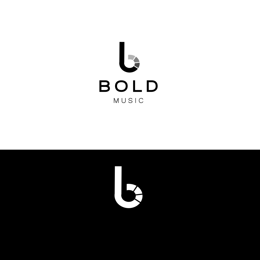
What I understand is that 'Bold Music' is a mix of simplicity as well as sophistication.
I wanted to put out something that'd reflect the mature side of your organization alongwith giving it a modern aesthetic feel.
The main part of the logo is the 'b'. It not only represents the alphabet but also images a minimalist 'headphone' which I think perfectly encapsulates the whole theme at once.
The choice of typography was to keep it as clean as possible which is perfectly achieved by 'work-sans'.
Keeping the colours neutral beautifully adds to the mature and sophisticated feel that I was trying to achieve.