Design for a fashion logo aimed at women interested in fitness

0
Created on 99designs by Vista
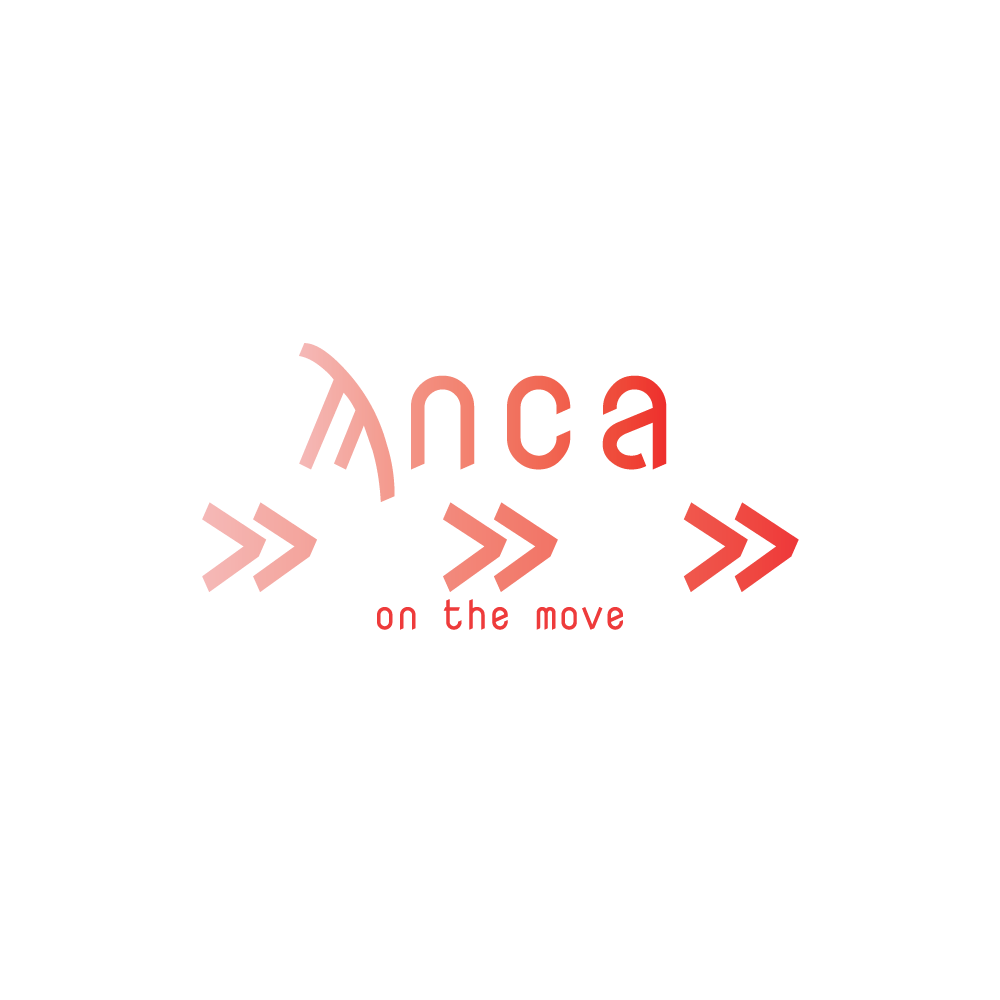
As red was the primary colour specified in the brief and as the target audience was female, I chose to keep the reds rather light. The gradient from light to dark across the logo is intended to convey a sense of movement, as are the arrows.