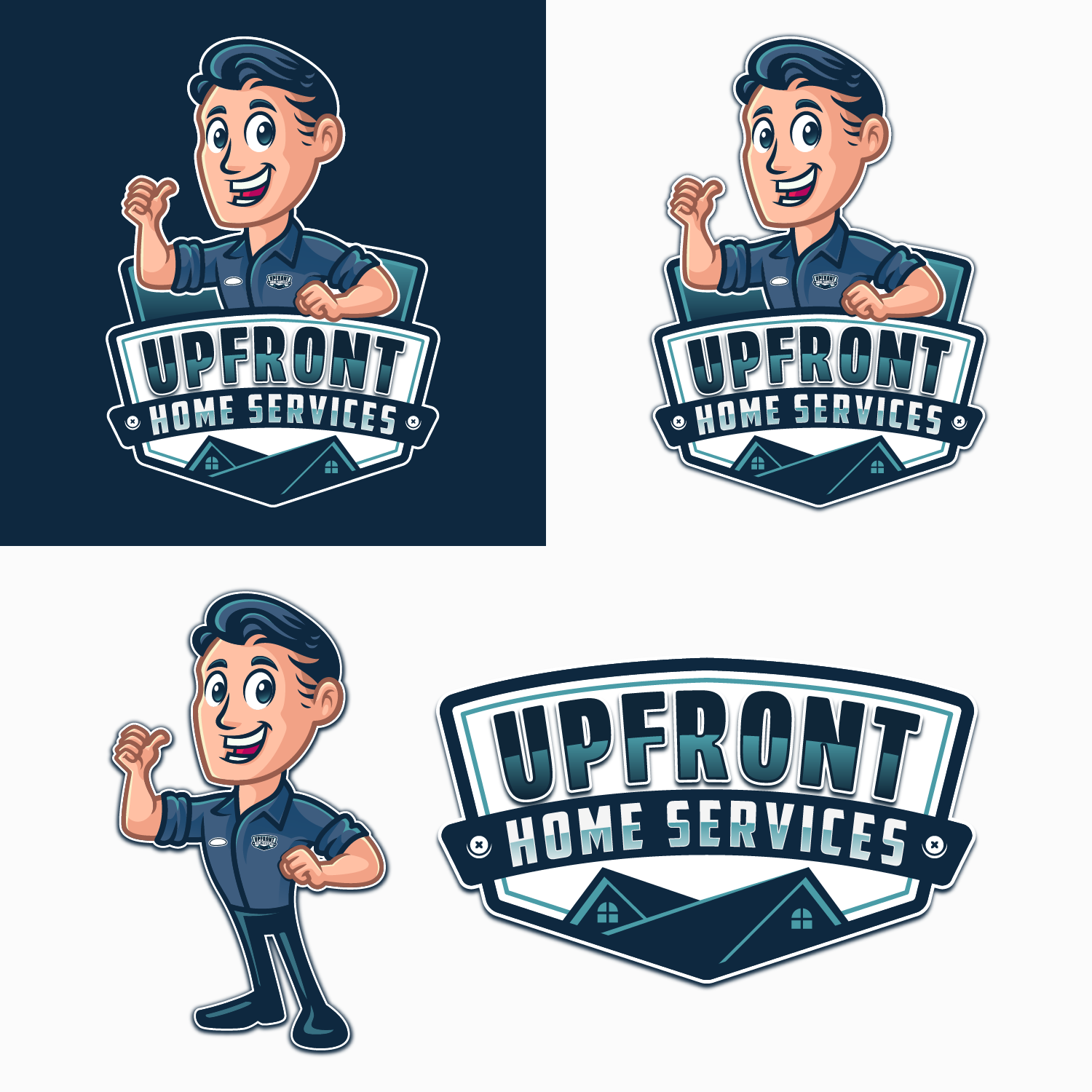
Upfront home services mascot logo

11
Created on 99designs by Vista
I created this logo without leaving behind the color aspects and characteristics of the previous logo. in navy and light blue. In this update I made the house look more dimensional but still simple. so it looks more modern. I chose a bold serif font so that the company name would be balanced, looking harmonious with the mascot I included. for the mascot, I tried to make it more welcoming and friendly. because this company operates in the service sector. thus leaving a good impression on customers. I really enjoyed and enjoyed making this logo.