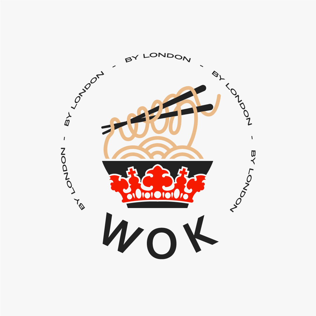

The first task in creating the logo for WOK was to combine refined English style with oriental, because WOK is a project from London SH.
To this end, we have modified the standard WOK plate for this concept by adding a branded crown from London SH. We deliberately avoid serif bars (similar to the London SH logo) to add a bit of street style to the new WOK logo and make it unique. At the same time, the caption below "by London" is written in the London SH brand font and directly indicates the owner of the project.
The logo is quite easy to adapt: it can be used in vertical, horizontal and circle versions.