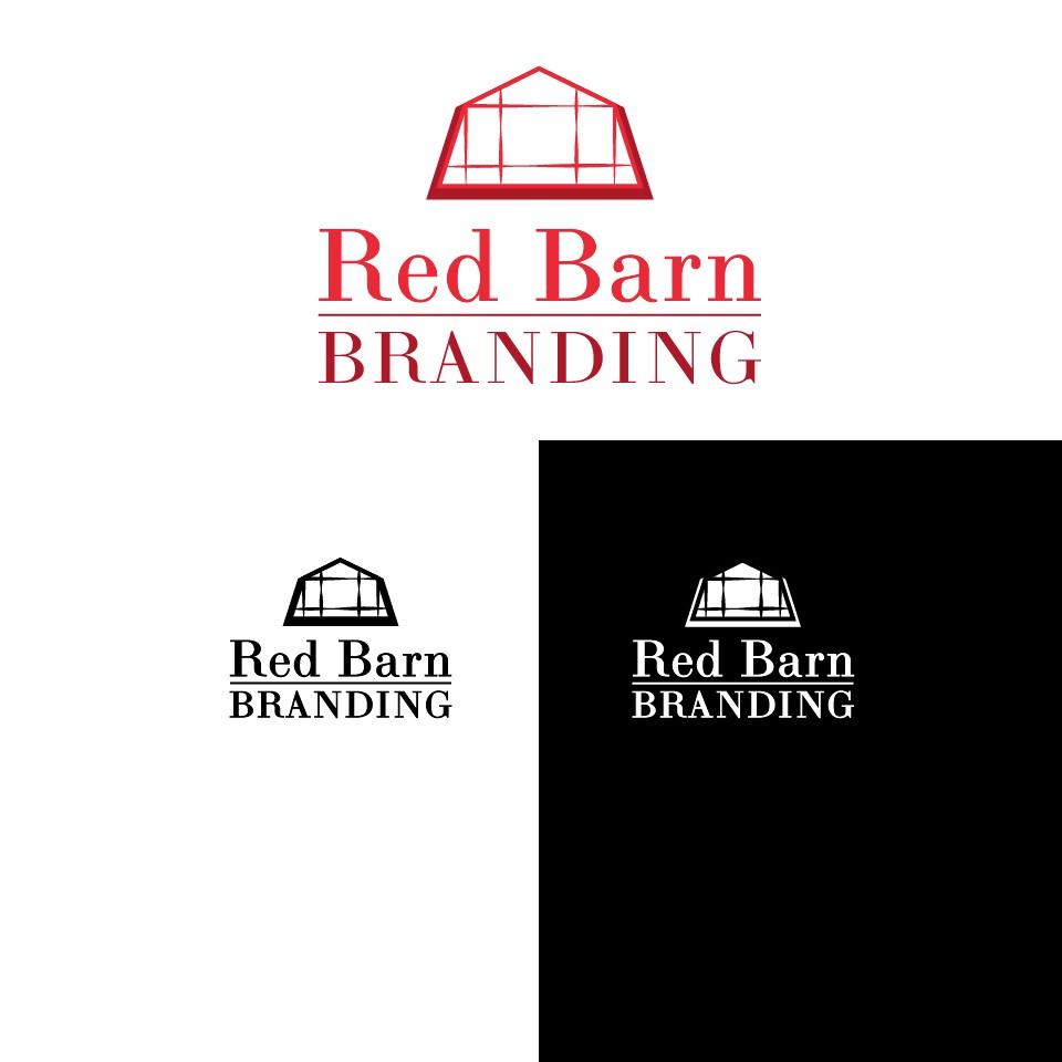
Logo Design for Red Barn Branding
0
Created on 99designs by Vista
For the graphic element within the logo I took the shape of a traditional red barn roof and added features of a window, inspired by a photograph I found of a renovated barn that had this modern adaptation. The window panels were given a varied stroke to soften the design and imply thread/stitching.
I choose Bodini as the font because it is timeless and sophisticated. The colour combination was chosen to give depth and dimension to the design and to establish the hierarchy of the words Red Barn as the focal point.
