
This revolutionary way of constructing 3D beverages through the technology of printing is an incredible concept. The company itself is already very well established with multiple high name brands under their belt.
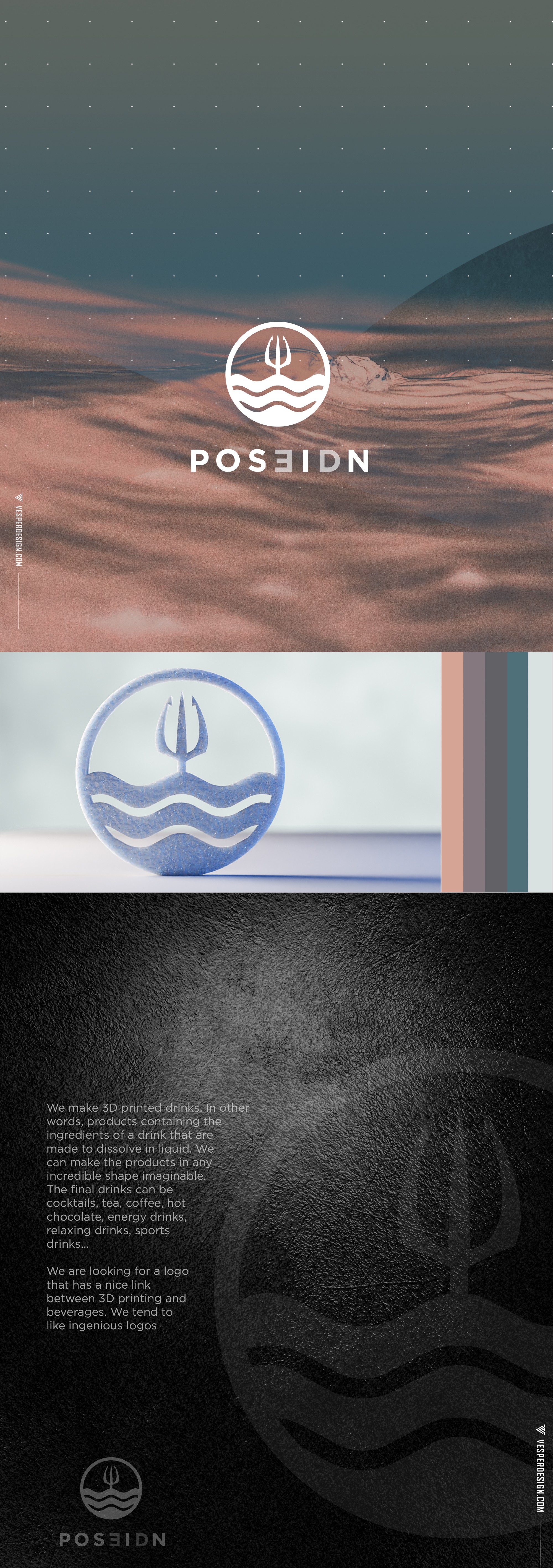
They were looking to develop a retail brand that centered around water and Greek Mythology as a concept. The waves were meant to evoke a sense of simplicity and softness, while the emanations of the Trident from the ocean was meant to center the concept.
The typography was also something I wanted to leverage. I felt an opportunity presented itself in the word Poseidon. When flipping the E and using the D in the name an interesting concept emerged with the use of an appropriate Typeface. The word 3D emerges. To my surprise, I found out that the team had already considered using Poseidn. Great synchronicity occurred and this design was the result.