
A recently established solar panel company sought my expertise in crafting a distinctive logo that would embody the essence of their eco-friendly energy enterprise.
Through a few iterations, a design emerged that resonated deeply with both the company and myself.
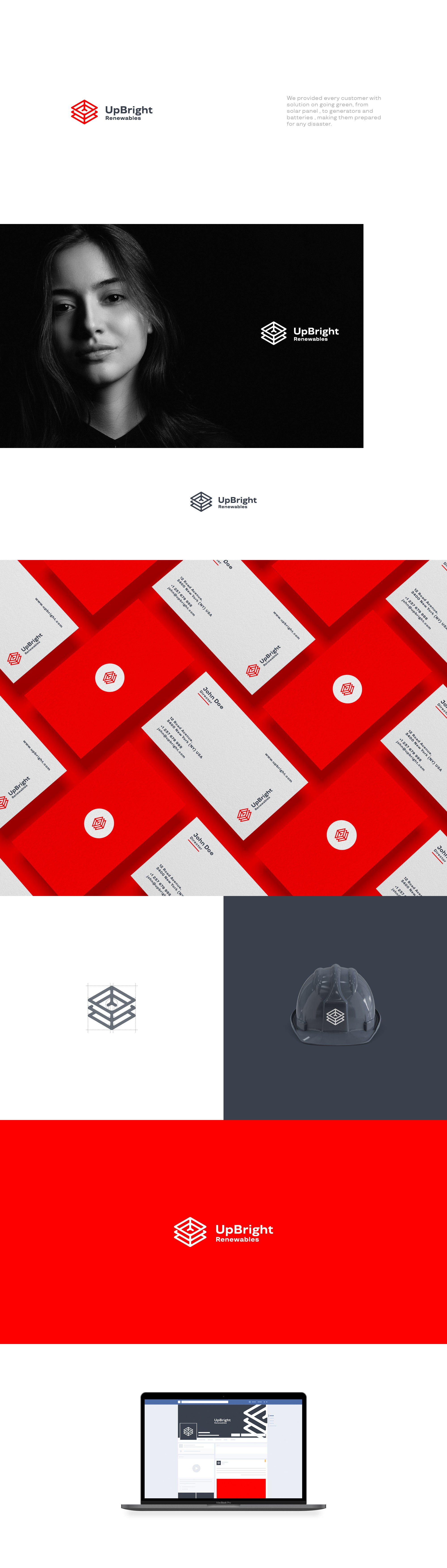
This logo, characterized by its minimalist and geometric elements, captivated our attention.
Inspired by an abstract interpretation of solar panels, three squares harmoniously converge, creating a focal point that seemingly revolves around the end-user. This symbolism captures the essence of sustainability and forward motion inherent in the company's mission.
The deliberate minimalism of the design imparts a sense of timelessness, modernity, and inclusivity, ensuring its relevance across diverse audiences and enduring relevance in the dynamic landscape of green energy.