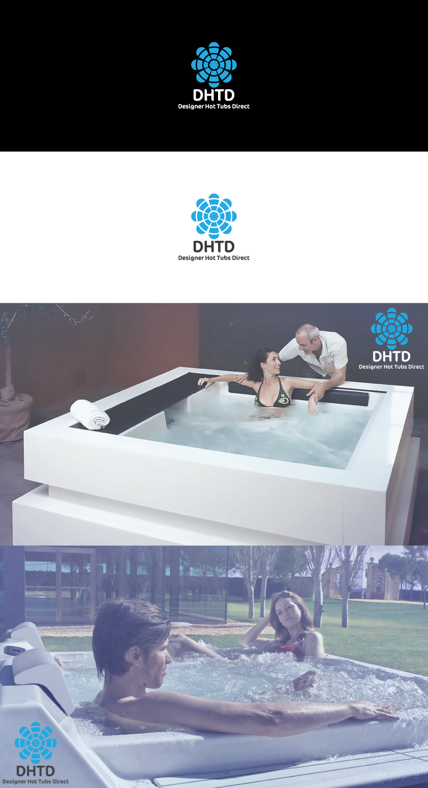
Modern and Simple Hot Tub Logo

0
Created on 99designs by Vista
The thinking of this logo was to create something that captures the water element but that doesn't really shout it at you. The blue is to signify shapes which are water drops with the cut out sections signifying ripples. Combined with a lovely font... Finished it off perfectly.