Modern logo concept for medical company

0
Created on 99designs by Vista
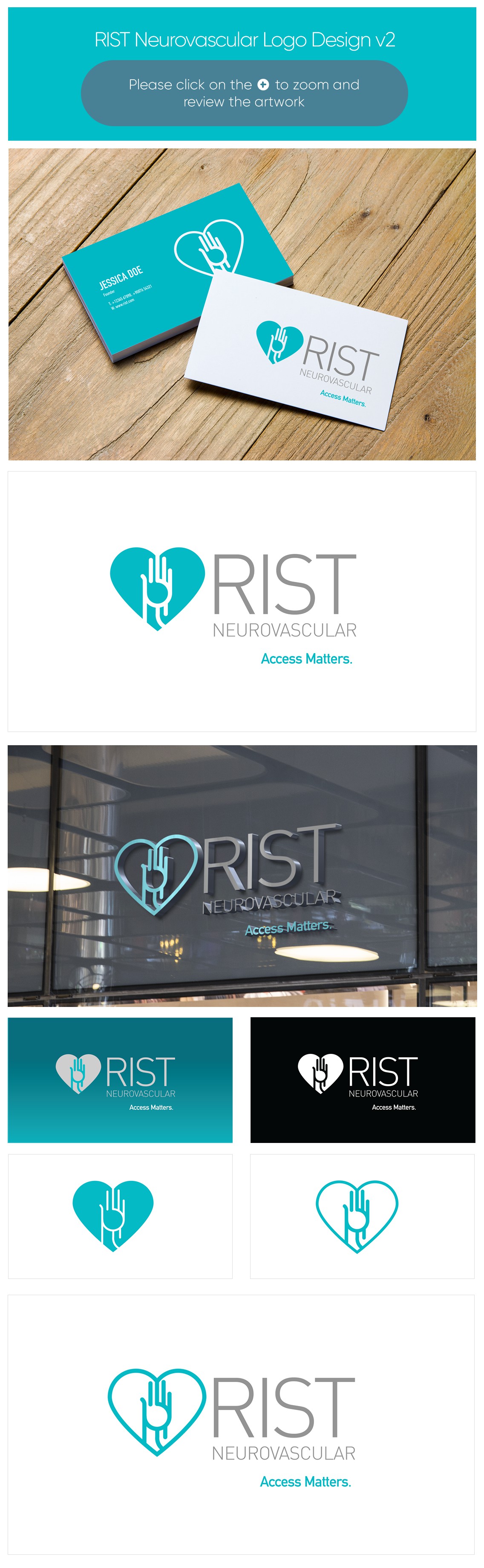
The logo is required for a company who produces a medical device designed to enter a blood vessel in the wrist - navigate though the blood vessels of the body - and treat blood vessels in the brain.
Combining a clean illustrative hand with a line coming from the "RIST" presenting a catheter the logo resembles a "R" for RIST. A cyan and light grey colour preference was used providing a medical feel.