Speers Point Pharmacy

53
Created on 99designs by Vista
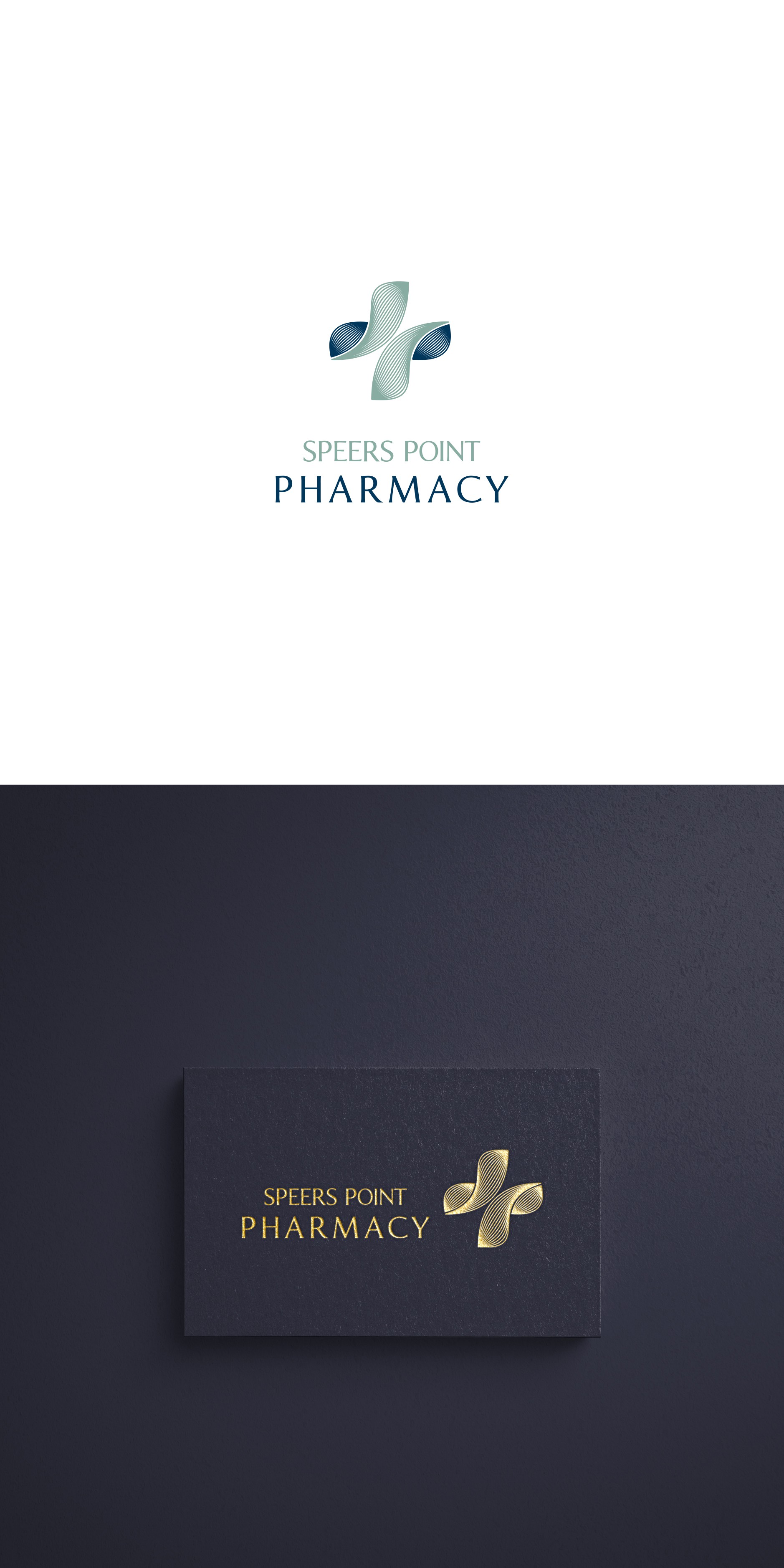
Sophisticated logo, which has a cross as a base, says it is related to medicine/pharmacy. The icon itself has an organic feel, thus representing that the pharmacy offers a holistic approach. Green color with a hint of gray is the color of eucalyptus, which has its wide application in healing.