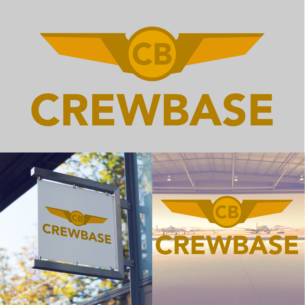

For the branding of CrewBase I deiced to go with a classic image that is associated with aviation, the pilot wings. Since the organization is catering to pilots and their crew exclusively, why not have something that represents the industry well and looks iconic. I gave the wings a modern look while keeping the icon recognizable to those both in and out of aviation. In your document you gave some references to what logo mark CrewBase needed. I combined a modern elegant design with some abstract styling. I chose to go with a gold color scheme since yellow and gold are representative of optimism, honor, loyalty, and traditional. The logo mark itself is meant to be used with type and standalone as a symbol for CrewBase. The logo is meant to last the test of time since it doesn’t reply on trends to make it standout, but focusing on being an icon. The typography for the logo is a san serif meant to give off a clean polish look for the brand.