Logo for a hiking-route app

42
Created on 99designs by Vista
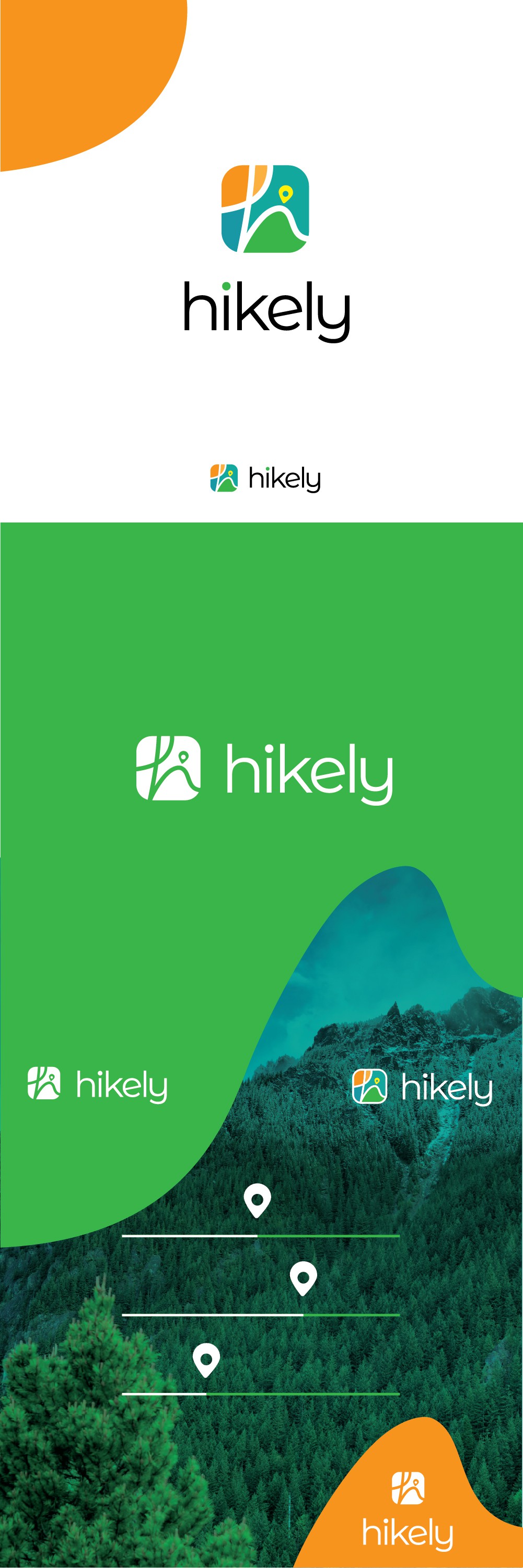
The design is a colourful, friendly icon, comprising a hand-written letter "h" which represents a meandering path. This represents the variety of the routes you can find with Hikely, which is what sets this app apart. The icon can therefore be seen as a map, but also as a mountain-sky-sun landscape. The wordmark typeface is clean and modern, to complement the icon. The alternate "e" that was chosen is turned upwards, to suggest playfulness, activity and altitude. for the branding concept, I used the bright, happy colours of the logo and the rounded, playful shapes contained by it (sun and mountain).