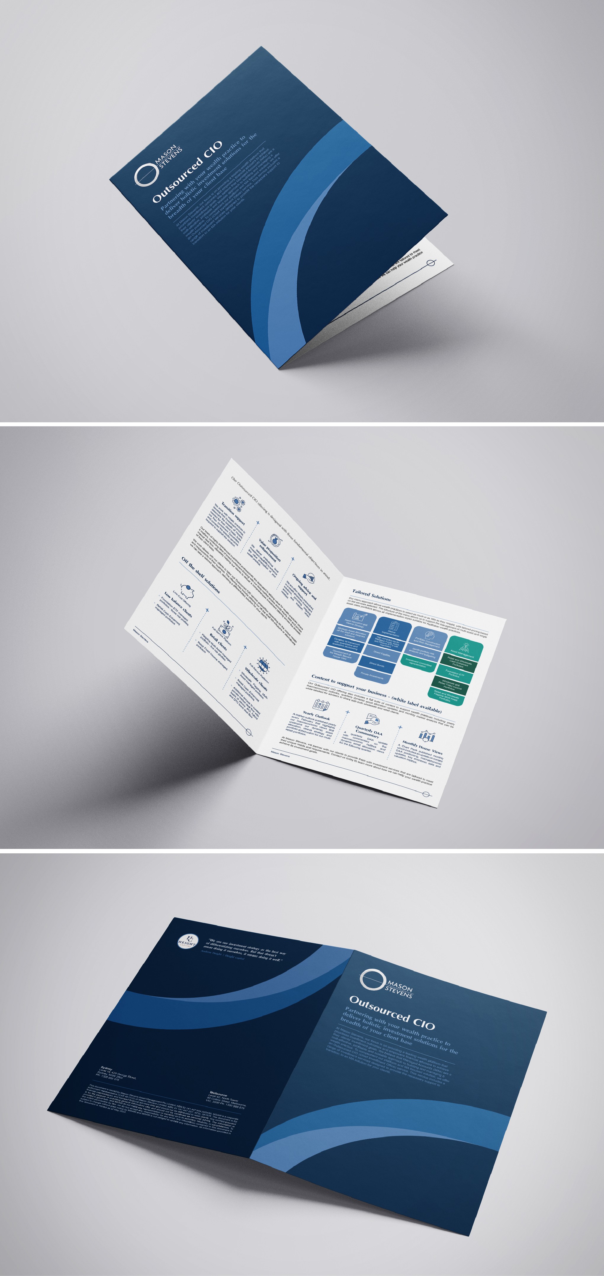

The client requested a redesign of their overcrowded brochure layout to create a clean, breathable space that enhances readability and visual appeal with white background except the graph.
I organized the content strategically to ensure it flows naturally and is easy to navigate. Key improvements include:
*Enhanced Readability & Visual Hierarchy: The text is structured to be easily readable, with a clear visual hierarchy to emphasize important information.
*Custom Icons
I added more custom icons to highlight key points, making the content more attractive and easier to understand.
*Balanced Layout
The layout is balanced with a mix of text and visuals, ensuring no section feels overcrowded and maintaining the reader’s interest.
The redesign aims to provide a more engaging and user-friendly experience, making the brochure both informative and visually appealing.