Created on 99designs by Vista
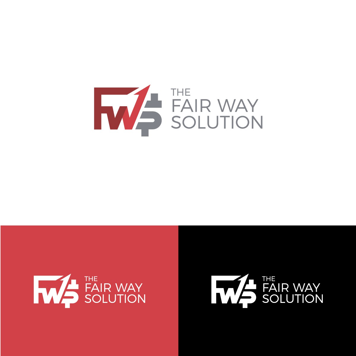
this logo design is inspired by the initials of the company name, FWS. The F-W looks like a pulse or ascending graph with arrows, and if you look closely you will see a wrench shape in the negative space. As for the letter S, it looks like a dollar sign symbolising finance.
This symbolises that the company provides solutions, improvements, and breakthroughs to clients who are experiencing financial (credit) problems.
