
This Logo took me about 4 days of work because I didn't use any font as a reference, and I wasn't satisfied with designing just one letter or two ( G and O), then simply writing the name using a font, because it leaves the logo looking uncomplete in my opinion, I really wanted the logo to perfectly fit together.
So I created all the letters in a unique typeface based on my previous design of GOBEST, that goes well with the style that I wanted. The new logo looks optically symitrical and it's strong, modern and most importantly clean.
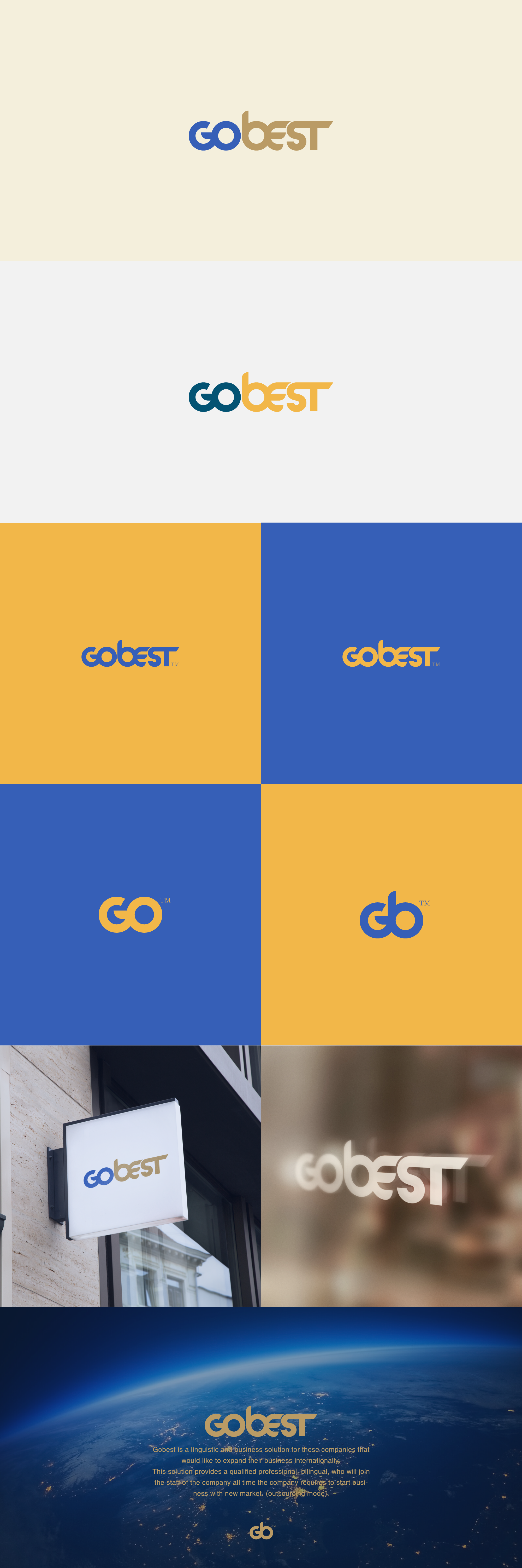
Choosing the right colors is another challenge. I decided to go with Blue/brown as a first option, brown looks so reliable and it's the color of earth, so when added to the blue color, it gives a strong feeling of security and stability. The second option is blue/orange, this makes the logo looks more energetic and more global but more aggressive, so I couldn't stick with one variation, both looks good.